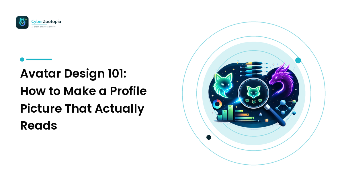
Your avatar is the hardest-working image you own. It shows up next to every message you send, every clip you post, every comment you leave — and almost always at a size smaller than a postage stamp. Most people design theirs at full screen, admire the detail, and never notice that at 64 pixels it collapses into a smudge. The takeaway up front: great avatar design is small-size design. Nail the silhouette, the contrast, and the crop, and your profile picture will be recognizable in a crowded Discord sidebar at 2 a.m. Miss those, and no amount of gorgeous detail will save it.
This guide covers the fundamentals that make an avatar read — the design word for "instantly understandable at a glance" — plus how to test yours before you ship it, and the honest pros and cons of commissioning, drawing, or generating your character with AI.
Why Most Avatars Fail at 64 Pixels
Open Discord and look at the member list. Most avatars in it are one of three failures: a full-body character shrunk until the face is four pixels wide, a busy scene where the subject melts into the background, or a dark character on a dark backdrop that reads as a gray circle. None of these are bad art. They're bad avatars, because they were designed for the wrong size.
Here's the reality of where your PFP actually lives:
- Discord chat: 40px next to messages, ~80px in the member list
- Twitch chat badges and channel lists: 28–70px
- YouTube comments: 40px
- X/Twitter timeline: ~48px
- Your phone's contact circle: smaller still
The version of your avatar most humans will ever see is between 28 and 80 pixels wide, usually cropped to a circle. That's the canvas you're really designing for. Everything else in this guide follows from that one fact.
The Three Rules of Readability
1. Silhouette First
Squint at your avatar until it's just a shape. Can you still tell what it is? That shape — the silhouette — is what the eye grabs first at small sizes, long before it processes color or detail. Strong avatar silhouettes have a distinctive outer edge: pointed fox ears, curved dragon horns, the frilly gills of an axolotl, a chunky pair of headphones. Weak silhouettes are round blobs with the interesting parts hidden inside the outline.
This is one big reason animal and creature avatars dominate creator spaces. Ears, horns, snouts, and tails punch out of the circle crop in ways a human head simply can't. A fox and a wolf and a cat all read differently in silhouette alone — that's free recognition your avatar earns before anyone even sees the details.
2. Contrast Is Recognition
At small sizes, contrast does the work detail can't. You want two kinds:
- Subject-background contrast. Your character must separate cleanly from what's behind it. A light character on a dark backdrop (or the reverse) survives shrinking; tone-on-tone mush does not. This is why the neon-on-dark look — a glowing teal fox against deep navy — is so effective as an avatar strategy, not just an aesthetic: the palette is the contrast.
- Internal contrast. The face needs a focal point that pops. Bright, slightly oversized eyes are the classic move; they're the first thing humans look for in any face, at any size.
A quick test: convert your avatar to grayscale. If it turns into porridge, your colors were doing contrast's job with hue alone, and hue is the first thing small sizes destroy.
3. Crop In — Then Crop In Again
The single most common avatar mistake is showing too much character. A full-body pose at 64px gives your face less room than a pea. Crop to the head and shoulders, or even tighter — face filling 60–80% of the frame. If your character's charm is in its expression (it usually is), spend your pixels there.
Mind the circle, too. Almost every platform crops avatars round, so keep the essential features inside a circular safe zone and let ears and horns break the edge deliberately rather than getting amputated by it.
Color: Pick a Palette, Not a Rainbow
Small images can hold about two or three distinct colors before they turn to noise. The formula that works:
- One dominant hue that becomes "your" color — the thing people associate with you across platforms.
- One accent for the focal point: eye glow, markings, an accessory.
- A quiet background that stays out of the way — deep navy, soft gradient, simple shape.
Saturated accents against a dark base are the most durable combination in creator spaces, and it's not an accident: dark backgrounds make bright colors look lit rather than merely colored, which is the entire trick behind the synthwave and neon-creature look. If you want your teal fox's eyes to glow lime, they need darkness to glow against.
One warning: match your palette to where you live. If your community runs Discord in dark mode (statistically, it does), test your avatar against dark gray first. A black-outlined character on a transparent background disappears there entirely.
Character, Photo, or Logo?
You have three broad options for what an avatar is, and they're not interchangeable.
A photo is personal and credible, but it's also small, low-contrast, and hard to make distinctive at 40px — one face in a sea of faces. It ties your identity to your face, which many creators specifically don't want.
A logo or wordmark scales cleanly but feels corporate, and text is nearly illegible at avatar sizes. Logos belong on banners and business cards more than PFPs.
A character — an original creature or mascot that represents you — is the creator-space sweet spot. It's expressive like a face, distinctive like a logo, works for camera-shy creators, and can grow with you: the same character becomes your emotes, your stickers, your stream mascot, your merch. If you're weighing this choice for a whole community rather than a personal profile, our mascot design guide goes deep on giving a brand or server a face, and the streaming identity guide covers extending one character into a full channel look.
Pick a Style That Survives Shrinking
Style isn't just taste — some styles hold up at 64px far better than others.
- Flat and cel-shaded styles read beautifully small: bold shapes, clean edges, minimal noise.
- Pixel art is made of small-size constraints and can look sharper at 64px than painterly art ever will.
- Low-poly keeps strong geometric silhouettes and simple color planes — very shrink-friendly.
- Neon/synthwave rendering earns its popularity: glow effects amplify contrast instead of adding clutter.
- Highly painterly or hyper-detailed styles suffer most; fine texture becomes mud below 100px.
Whatever you choose, commit. A consistent style across your avatar, banner, and emotes is what turns a picture into an identity.
Test Before You Ship: The Four-Check
Before you set a new avatar everywhere, run it through four fast checks:
- The shrink test. Scale it to 64px and 32px. Is the character still obvious? Is the expression still alive?
- The circle test. Apply a circular crop. Anything important lost? Ears clipped awkwardly?
- The grayscale test. Desaturate it. Does the subject still separate from the background?
- The lineup test. Drop it into a real screenshot of a Discord member list or a busy chat next to a dozen other avatars. Does yours pop, or does it vanish into the scroll?
Ten minutes of testing beats months of being a gray smudge in the sidebar.
Getting One Made: Commission, DIY, or Generate
Commissioning an artist gets you a bespoke character, exact revisions, and art with a human story behind it. It costs real money and takes days to weeks — worth it, for many creators, especially once a character is established.
Drawing it yourself is free and infinitely iterable, if you have the skill and hours. Most creators don't, and that's fine.
AI generation is the fast, cheap, iteration-friendly path: describe a species, a palette, and a style, and explore dozens of original creature designs in minutes until one clicks. Two honest rules if you go this route. First, keep it original — generate your own creature, never an existing character or a real person's likeness; original characters are the ones you can actually build an identity (and merch) on without a takedown. Second, be upfront that it's AI-generated. Platforms and communities increasingly expect the disclosure, and honesty costs you nothing — a good character is a good character.
That's exactly the corner of the world Cyber Zootopia lives in: an AI avatar and mascot maker for summoning original neon creatures — glowing foxes, dragons, axolotls — built for the small-size, high-contrast, big-silhouette rules this whole guide has been about.
FAQ
What size should I design my avatar at? Design at 1000×1000px or larger so you have a crisp master file, but evaluate every decision at 64px. Export platform sizes down from the master. The big file is for the future (banners, merch, print); the small preview is where the design succeeds or fails.
What makes an avatar readable at small sizes? Three things: a distinctive silhouette (shapes like ears or horns that read in outline), strong contrast between subject and background, and a tight crop with the face filling most of the frame. Detail contributes almost nothing below 80px — shape and contrast do the work.
Should I use my face or a character as my avatar? For creators, a character usually wins: it's more distinctive at small sizes, works if you're camera-shy, stays consistent across platforms, and can expand into emotes, stickers, and a mascot. Use your face where personal credibility is the point, like a professional network.
Is it okay to use an AI-generated avatar? Yes, with two conditions: the character should be original — not a copy of existing IP or any real person's likeness — and you shouldn't hide that it's AI-generated. Honest labeling is increasingly the platform norm, and an original AI-generated creature is fully yours to build an identity around.
Your avatar is the front door of everything you make — design it for the 64 pixels where it actually lives. And if you'd rather summon a character than wrestle a drawing tablet, see what Cyber Zootopia is building: an AI avatar and mascot maker for creating your own original neon creature, from glowing fox to holographic axolotl.