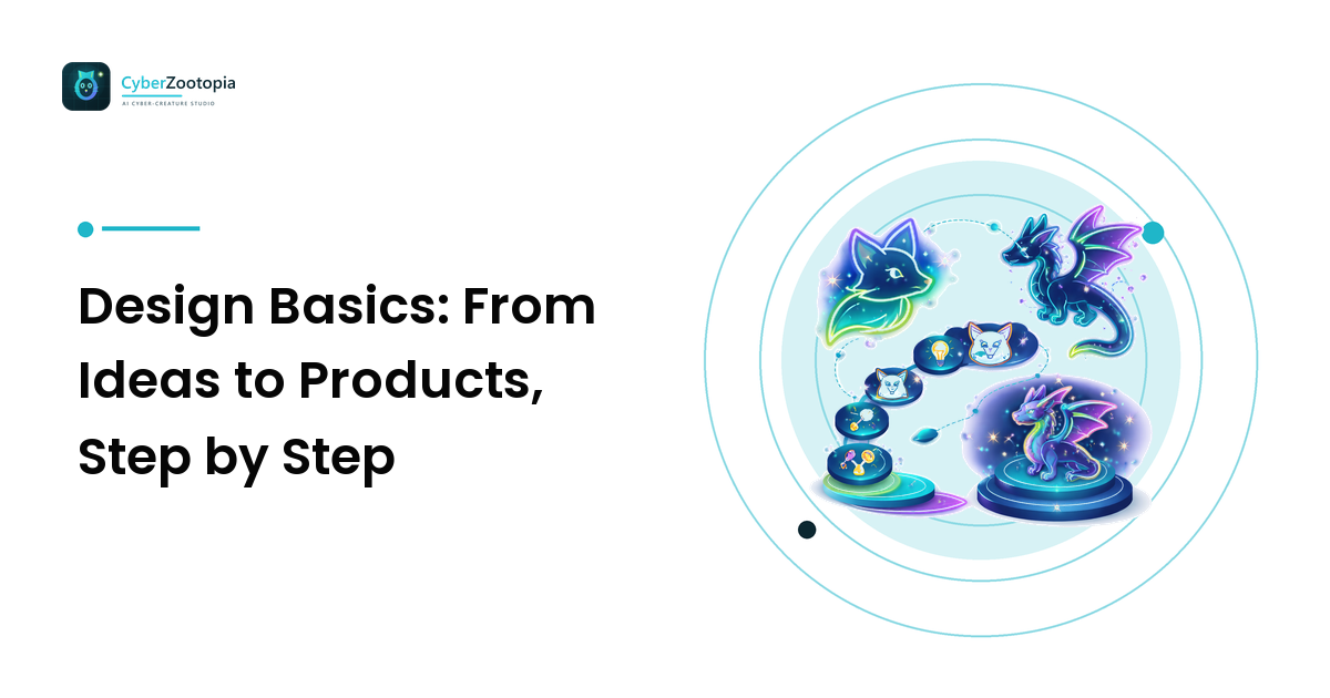
Every character you love online started as a half-formed idea in someone's head. The gap between that spark and a finished avatar sitting on a Twitch panel, a Discord icon, and a sticker sheet isn't talent — it's process. This guide walks the design basics from ideas to products: the repeatable path that turns "I want a glowing fox mascot" into art you can actually use everywhere. The takeaway up front: good design is a series of small, deliberate decisions, not a single flash of genius. Learn the stages, and you stop staring at a blank canvas and start shipping.
We'll move through five stages — brief, exploration, refinement, production, and rollout — and along the way answer the questions creators ask most: how a branding style guide fits in, what "design basics" actually means, and how to get your character onto profiles, products, and platforms without the whole thing falling apart at small sizes.
What "Design Basics" Really Means
Before the steps, a definition, because the phrase gets thrown around loosely. Design basics are the underlying decisions that make an image work regardless of subject: shape (silhouette and composition), value (light versus dark), color (a deliberate palette, not a rainbow), and consistency (the same choices repeated so a viewer recognizes your hand). Everything in the ideas-to-products journey is just applying those four levers on purpose.
The reason process matters is that most beginners skip straight to "make it pretty" and get stuck. They polish a detail before they've decided the silhouette, or pick twelve colors before knowing which one is theirs. The pipeline below forces the big decisions first, so the polish has something solid to sit on.
Stage 1: Write a One-Line Brief
An idea becomes designable the moment you can say it in a sentence. Not "a cool creature" — that's a wish, not a brief. A real brief names the pieces: "A mischievous neon fox, teal and magenta, for a late-night gaming Discord." Species, personality, palette direction, and where it lives.
That single line is the most valuable design tool you own, because every later decision checks back against it. Wondering whether the eyes should be soft or sharp? The brief says "mischievous" — sharp wins. A tight brief kills the paralysis of infinite options by ruling most of them out before you draw a line.
Stage 2: Explore Widely, Cheaply
The classic beginner mistake is falling in love with the first idea and marrying it. Professionals do the opposite: they generate many rough options fast and stay unattached. This is the exploration stage, and its whole job is quantity — thumbnails, sketches, or quick AI generations you spend thirty seconds on and discard without guilt.
Explore the big shapes, not the details. What's the silhouette — pointy and alert, round and cuddly, sleek and sharp? Where does the character face? What's the general pose for a portrait crop? You're hunting for the version that makes you go "that one," and you find it faster by comparing ten rough options than by perfecting one. Keep the throwaways; a rejected pose is often next month's emote.
Best Designer Basics to Nail First
If you only master a few fundamentals before anything else, make them these — the highest-leverage basics for a creator identity:
- Silhouette. Squint until your design is a black shape. Still recognizable? Good. The outline does more work than any detail at small sizes.
- Contrast. Your subject must separate cleanly from its background, and the face needs a focal point that pops — usually bright eyes.
- A three-color palette. One dominant hue that becomes "your" color, one accent for the focal point, one quiet background. More than three turns to noise.
- Consistency. Repeat those choices across everything. Recognition is just the same decisions, seen twice.
Everything fancier — rendering, shading styles, textures — is optional polish on top of these four. Our avatar design guide goes deep on why silhouette and contrast decide whether a design survives being shrunk to 64 pixels, which is where most avatars quietly fail.
Stage 3: Refine the Winner
Now you commit. Take the one exploration that clicked and sharpen it: tighten the silhouette, lock the palette to your three colors, fix the composition so the face fills most of the frame, and make the focal point unmistakable. Refinement is where you subtract as much as you add — cutting the busy background, dropping the second accent color that fights the first, simplifying anything that muddies at small sizes.
Test as you refine, don't wait until the end. Shrink the design to 64 pixels every few minutes. If the expression dies or the character melts into the background, you've found a problem while it's still cheap to fix. A design that reads small reads everywhere; the reverse is not true.
Stage 4: Build a Branding Style Guide
Here's the stage that separates a one-off picture from a product: writing down your decisions so you can repeat them. A branding style guide sounds corporate, but for a creator it's a single note-card of rules:
- Palette: your exact colors, with hex codes.
- Character rules: the features that must always appear (the fox's oversized ears, the magenta eye-glow) and the ones that can vary.
- Do and don't: "always dark background, never busy scenes," "eyes always glowing."
- Voice: the personality word from your brief, so future art stays on-character.
The style guide is what lets your avatar, your emotes, your banner, and your merch all look like they belong to the same creature. Without it, every new asset drifts a little until your "brand" is five different foxes. Branding style guides are just consistency, written down so future-you doesn't have to re-decide.
Stage 5: Turn the Design Into Products
A finished design isn't a product until it's exported correctly for each place it lives. This is the "to products" half of the journey, and it's mostly about crops and sizes:
- Avatars for profile use: a tight, circle-safe head-and-shoulders crop. Almost every platform — Discord, Twitch, YouTube, X — masks avatars to a circle, so keep the essential features inside a circular safe zone and let ears break the edge on purpose. Export a large master (1000×1000 or bigger) and scale platform sizes down from it.
- Banners and panels: a wider composition with breathing room, using the same character and palette.
- Emotes and stickers: the expression cranked up, simplified for tiny sizes.
- Merch: the high-resolution master file, which is exactly why you kept one.
One product-stage rule from the editorial side: if your character is AI-generated, keep it original — your own creature, never existing IP or a real person — and disclose that it's AI-made where platforms ask. An original character is the only kind you can actually license, print, and defend.
Best Avatars in Roblox and Other Platform Styles
"Best avatars in Roblox" is one of the most-searched avatar questions, and it's worth understanding why platform-native styles look the way they do. Roblox avatars are blocky and 3D because that's the engine's render style — the "basics" there are readable body shape, a clear color combo, and accessories that pop against a game backdrop. The lesson generalizes: every platform has a house look, and a strong design respects the container it ships into. A flat 2D neon fox that rules your Discord PFP won't drop cleanly into a 3D game world, and that's fine — same character, platform-appropriate version. Design for where the image actually lives, not for how it looks on your full-size canvas.
Want to Go Deeper Than One Article?
A single guide can start you, but design is a craft you refine for years. A well-regarded design basics book — anything covering composition, color theory, and visual hierarchy — will reward you far past avatars. Look for titles that teach the fundamentals (shape, value, contrast, hierarchy) rather than a specific software, because the fundamentals outlast every tool. What you've read here is the creator-focused, small-size version of exactly those principles, aimed at getting you from idea to shipped product without a design degree.
FAQ
What are the basic stages of the design process? Brief, exploration, refinement, production, and rollout. You define the idea in one sentence, generate many rough options, commit to and sharpen the best one, document your decisions in a style guide, then export it correctly for each place it lives. The order matters — big decisions first, polish last.
How do I go from a design idea to a finished product? Start with a one-line brief, explore widely and cheaply, refine the winner while testing it small, write down your rules in a branding style guide, then export platform-correct versions (circle-safe avatar, wide banner, punchy emote, high-res merch master). The style guide is what keeps every product looking like the same character.
What are the most important design basics for beginners? Silhouette, contrast, a three-color palette, and consistency. Nail those four and your design will read at any size; skip them and no amount of detail rescues it. Rendering and texture are polish that sits on top of these fundamentals.
Do I need a branding style guide for a personal avatar? Yes, even a tiny one. A note-card of your exact colors, must-have character features, and a personality word keeps your avatar, emotes, banner, and merch consistent. Consistency is what turns a picture into a recognizable identity.
Design is a pipeline, not a lightning bolt: a brief, a wide search, a committed refine, a written-down style, and clean exports. Follow it and you'll ship characters instead of second-guessing them. And if you'd rather move from idea to finished neon creature without wrestling a canvas, see what Cyber Zootopia is building: an AI avatar and mascot maker for summoning your own original glowing fox, dragon, or axolotl — built around exactly the small-size, high-contrast basics this guide walked through.